We were recently set a challenge in a Facebook group to make designs looking like neon lights. This article documents how I went about it using Affinity Designer (v1).
Set a background
I wanted the lights to be mounted on a brick wall, so I chose a stock image of bricks:

But I wanted the design to be at night on a dimly-lit wall, so I added a rectangle of dark brown and set the blend mode to multiply and reduced the opacity:

Neon lights are tubes
Neon lights are glass tubes with Neon gas inside them. The easiest way to draw them is as curves with strokes to add effects later to make them look credible. The glass tubes always have two ends, so closed curves are not an option. I started with the word ‘OPEN’ and I used the Pen Tool (keyboard shortcut, P) to create a version of each letter that is a single curve with open ends.
At the very ends I added a kink using the Node Tool (A), representing the joins of the neon tubes to the infrastructure supplying the power to the lights and holding the lights in place. I didn’t show any of that infrastructure, but I think the view can suspend disbelief and be fooled that the kinks are connecting to somthing.
Here is the outline view of the curves I used:

Notice how the letter E has to loop back on itself in order to be continuous tube. This is what we see in real neon lights.
I framed the word OPEN with a rounded rectangle and used the Node Tool to break the curve and add a kink as as for the letters. Right, that is the hardest bit done, the rest is much easier.
Choose the colours for the lights
In my experience, neon light are usually red, green or blue. I chose blue for the letters and red for the rounded rectangle and set the stroke Hues accordingly, but with the Saturation and Lightness set high, because these are lights, afterall. The result is flat and very unconvincing neon lights. But we can see the direction we are heading in. I set the stroke of the curves to a suitable thickness.

Making the tubes less flat
Next I started to add layer effects (fx) to the curves to make them more convincing. The effect is 3D. I decided that brightly shining lights would not allow the viewer to see the specular reflection of the glass tubes, but that diffuse 3D would be appropriate to stop them looking so flat and helps to highlight the kinks in the tubes:

Outer Glow
Next I wanted the area immediately next to the lights to be brightly lit. For this I used the Outer Glow effect for the curves representing the lights (the 3D effect has been turned off this this image):

For each light, I set the Outer Glow colour to be the same Hue and Saturation as the stroke colour, but made the lightness lower (60%) so that the colour is more intense.
But this is still not complete, because the lighting further away from the tubes is not captured.
Outer Shadow
The trick here (thanks to Chris Hildenbrand for this one) was the use the Outer Shadow effect not as a shadow, but as a glow. Shadow colours and blend modes can be changed. I set the colours the same as for the Outer Glow, but set the Blend Mode to Add. The radius of the effect was increased to make the more subtle lighting from the tubes spread to areas slightly further away than the Outer Glow reached (othe effects turned off for this image):

Notice how the Outer Glow blends with the brick wall background, genuinely seeming to light it up.
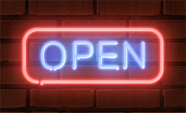
Combine the effects
Putting all three effects together produced the following image:
Expanding the design
I added a cocktail glass and bubble to complete the design. For this I used white and green lights. The bubbles are drawn as open curves, no closed circles allowed, in order to look like neon lights:

More realism
I had a second go at this challenge and tried to recreate the iconic neon sign from Ronnie Scott’s jazz club in London:

And here is the outline view showing the curves used for the lights and the other vectors used for the sign and lighting and shadows on the brick wall:


Leave a comment