The more I learn, the more I realise success is about getting the analysis right. What I mean is, the wrong approach will fail because it rapidly becomes too hard to do, whereas the right approach can succeed only through structure and a disciplined deployment of the right tools.
As a beginner, one does not know what tools are available nor enough examples of good process learned from good graphic designers who know what they are talking about.
So, I spent a couple of days looking at spherical soap bubble images and analysing what components are required in a convincing image and thinking about what process I would adopt.
Warning, some of the tools (Warp Groups) used in this artilce are not availble in Affinity Designer v1.
Components of the image
The list I came up with is as follows:
- Background: The luminoscity of the background of the image determines what detail can be seen in the bubble surface. If the background is black, only the edges of the bubble can be seen. This is probably realistic, but might not be the desired outcome. I played with giving the bubble a low opacity fill so that surface detail could be seen even on black backgrounds, but decided it looked less realistic.
- Bubble edge. I found an outline of the bubble was needed to make it standout on lighter backgrounds. I just used a thin dark brown stroke. One lesson I learned was that having a range of backgrounds to check the bubble on really helped. Using symbols for this meant that I could just continue to edit one bubble and see the results on several different backgrounds at the same time.
- Specular reflection. The surface of the bubble is somethat like a concave mirror. It is very shiney, so the reflected image is sharp, but it is also distorted due to the concave surface. All the source images I could find showed that there are actually two copies of the reflection, pretty much the same as each other but one is flipped upside down and back to front.
- Irridescent colours. Like peacock feathers or petrol on the road, the colours needs to really shine out and cover most of the rainbow.
- Highlights. There are rim lights, a general halo inside the edge of the bubble and distorted highlights within the bubble surface (assuming it is being lit from the front).
All the right parts, but not necessarily in the right order
It makes a big difference what order the layes are in. Often highlights are on top, but I did not find this looked best. The order I found best was:
- Bubble edge
- Reflection image
- Highlights (the ones distorted by the concave surface)
- Rim lights
- Irridescent colours
- Halo highlight
Halo and bubble edge
So, on a mid-green background, here is the Halo highlight and Bubble edge combination (the two outer layers in the stack). The Halo is made from a white circle, with radial transparency from the outer edge towards the centre. I played with dragging the mid point on the transparency tool until it looked right.

I know! It already looks like a bubble, right?
Spherical surface distortion
Objects on the surface of the bubble need to appear distorted to the viewer because they are mapped onto a concave surface. To achieve this I used the new Warp Group feature of Affinity Deisgner v2. I wasn’t exactly sure how to get the exactly correct warping, so I decided to set a checker board fill to the bubble and drag the warp mesh nodes around until it looked close enough to a sphere to my eye.
I started with an off-the-shelf fish-eye warp group set around a circle the size of the sphere and started dragging nodes. The idea is that all vertical mesh lines go between top centre and bottom centre. and all horizontal ones go between left centre and right centre. Nothing should show beyone the circle edge because it has vanished over the horizon.
It is not perfect, but it is close enough for jazz.

Reflection image
I needed a test reflection image, so built this simple scene to project onto the sphere surface using the warp group:

My collection of reference images pulled from the Internet showed that spherical bubbles always seems to have two copies of the same reflection overlapping each other. But one is the 180-degree rotation of the other. I made the image above Symbol and duplicated it. One copy of the symbol was flipped both vertically and horizontally (180-degree rotation) and both were put inside the warp group made earlier.
One symbol was positioned in the upper half of the circle and the other below it in the lower half. I then dragged the image inside one of them around until I was happy with the look. The warp group ensures it looks like the reflection is on mapped onto the concave surface of the sphere:

I wanted the reflections to merge when overlapping so I made sure they had 50% opacity. I set the blend mode to Overlay. This is a good blend mode to use here because light areas become lighter and dark ones become darker, ensuring the reflection is clear under various conditions of underlying layers. One never knows where the bubble might end up being used.
Exciting, eh? I was really pleased with the distortion. As the image moves towards the horizon at the edges of the sphere, it bends and bunches together.
Highlights
I wanted highlights top right and bottom left on the sphere surface to mach what I was seeing in my reference images (which I am not including here, becasue I don’t own them to share). I made white ellipses and gave them a little Gaussian blur and set them within the warp group so that they could also be a little distorted by the sphere surface. They were set to Screen and 40% opacity.
Rim lights were also added in the same areas as tapering white strokes set to Screen and 90%.
Irridescent colours
The final step is to add those crazy rainbow colours that look like petrol on the road and a peacock’s feathers. I just made a couple of elliptical gradient fills with suitable colour stops taken from refence images. Once I had sampled the colours I changed them to ensure they were fully saturated using the HSL colour slider (S). Then the layers were set to Linear Light blend mode and 50%. I tried a lot of other blend modes for the colours, but this seemed best to me.
It is not possible to distort the gradient fills because it is implements as a bitmap (though watch this space because Serif says it is coming in Designer v2.1.

Summary
Putting the layers together, here is the bubble with colours and highlights added together but no reflection:

And here is the final complete image with reflection.

Once you have made your bubble, you can play with alternative reflections. Here is the Heron:

I added a Brightness/Contrast adjustment layer to the reflection here and was pleased to see that it caused interference patterns not unlike those on the surface of a real bubble!

A celtic knot vector I had made earlier makes quite a nice reflection.
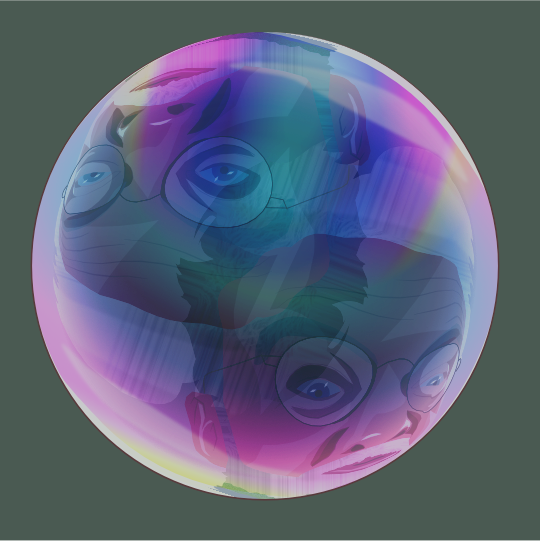
This one has a vector portait of me I made about a year ago.


Leave a comment